prodigy
I joined Prodigy as a Game Artist and was quickly promoted to Lead, and shortly thereafter to Art Director for Prodigy Math Game. This progression reflected both the pace of the product’s growth and the level of ownership I took on across creative and team leadership.
As Art Director, I was responsible for defining and evolving the visual direction of the game while scaling and managing a 25+ person art department. My role spanned creative leadership, people management, and project planning, with close cross-disciplinary collaboration across design, engineering, product, and production to support the growth of a multi-million-dollar live product.
This experience required adaptability, long-term thinking, and a deep investment in both the team and the product-shaping not just how the game looked, but how it scaled sustainably over time.
Artwork displayed belongs to Prodigy Education and varies in execution by different artists, including myself.

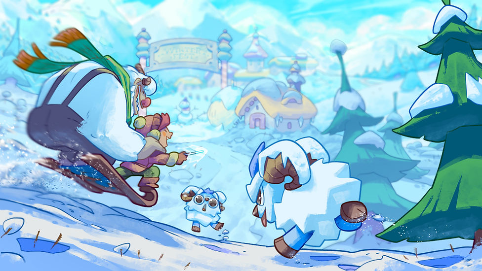
Educational Games don't have to be boring
One of my greatest challenges and proudest achievements, was the overhaul of Prodigy Math Game. This educational MMO started off in a visually dated, and very choppy experience, with a little over 700K users when I came onto the project. Over the years, it has grown and flourished into one of the biggest MMOs to date (second only to World of Warcraft) in user count.
This game was a labor of love, and by building an incredible team of some of the most talented, and driven individuals, it has grown into what it is today. The game has secured the largest ed-tech investment in history and continues to grow and captivate students, teachers, and parents.


Some early logo concepts for Prodigy Math Game.

IDEATION
Before being able to develop any sort of concepts, I firmly believe a concrete strategy needs to be established. One of the core reasons this project was an immense challenge was the gargantuan size of the overhaul.
When a project is smaller or new, it obviously takes less time to plan and establish a new course of action. But in this case, Prodigy has a product that is multi-faceted, has a much deeper purpose than simply increased engagement. The game needed to be timeless, effective at grabbing attention, of course retaining it, and entertain continuously all while maintaining a user's focus on educational content.
Conception
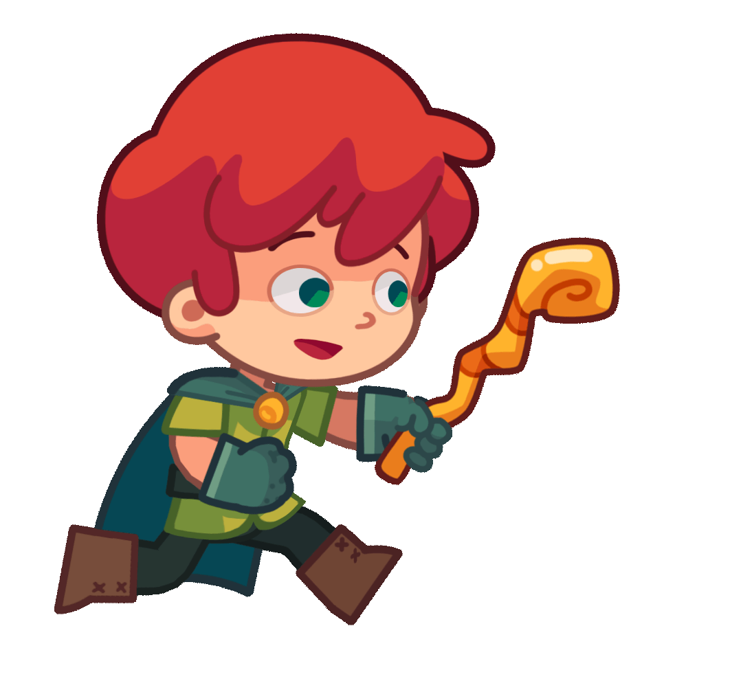
The first concepts consisted of understanding current trends in the mobile game industry. Shape language, colours, interactive elements, and of course the avatar redesign.
I developed mood-boards, palettes, and the pillars of design which then began taking shape in new concepts for characters, environments, and a new UI flow and style.


Animation team - New avatar texture and outline treatment.
Artwork displayed belongs to Prodigy Education

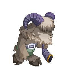
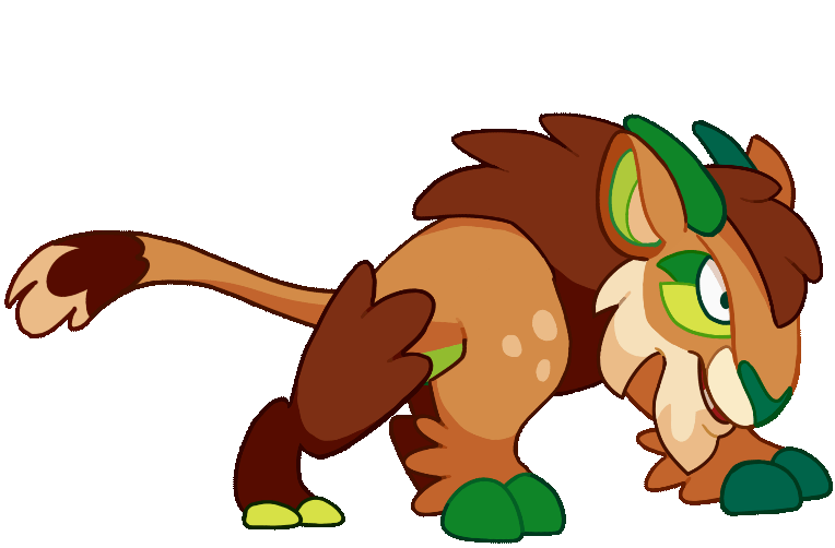
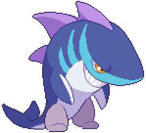
Slime NPC concepts.


Palette exploration for rasterized zones.

Concept team - shape language exploration.


Production team final assets.


Execution
Once an art bible was established in tandem with understanding the technical capabilities and limitations of our engine and code, the next step was navigating the transitionary period for when two visual styles collide.
This was a very time consuming process with hundreds of thousands of assets to be altered or replaced entirely.


three step transformation
Due to the nature of the product, we couldn't easily swap assets and improve visuals with the technical limitations at the time. This meant finding an in-between alternative that would keep users engaged with exciting, vibrant, new designs in a pixel art format.
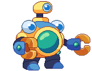
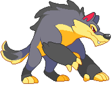
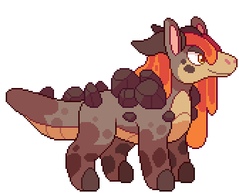
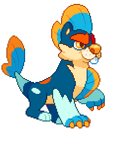
Animation team - transitioning style pets.

Splashpages.
.png)
Visual Development Milestones
Transitioning from Pixel > Pixel Upgrade > Raster Revamp